Caitlin Donahue
Work
About
Resume
Work
About
Resume
Caitlin Donahue
Scroll
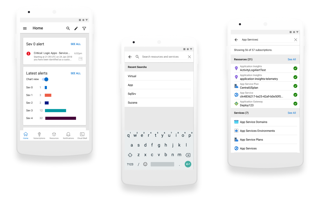
Azure Mobile App
A global search experience